Learning Path
Get started with IBM Cloud Pak for Data
You can discover insights from your data by creating visualizations. By exploring data from different perspectives with visualizations, you can identify patterns, connections, and relationships within that data and quickly understand large amounts of information. You can build a chart by selecting a predefined chart type from a gallery or by combining basic elements from the provided chart type options (for example, axes and bars).
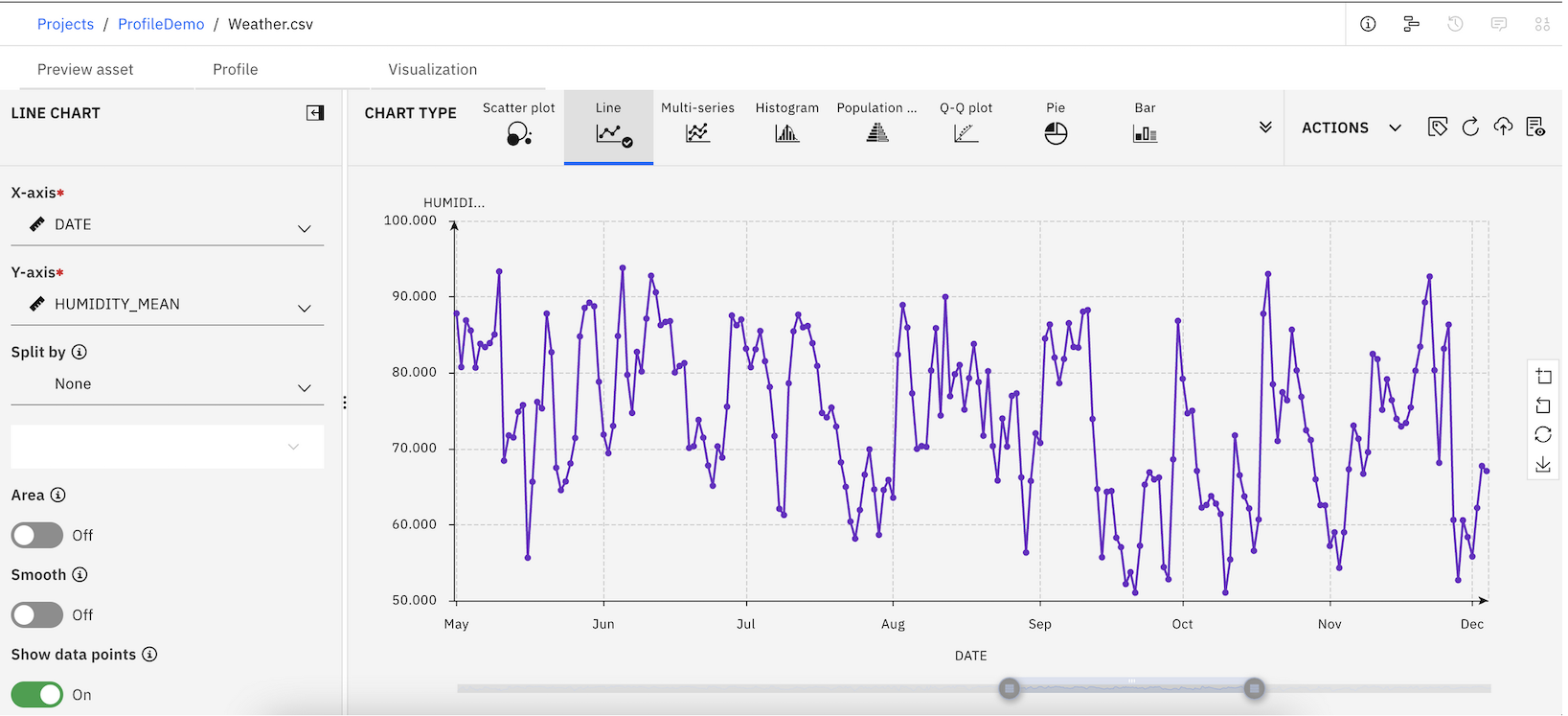
Data visualization terms
- Canvas: The canvas is the area of the Visualizations dialog where you build the chart.
- Chart type: This lists the available chart types. The graphic elements are the items in the chart that represent data (bars, points, lines, and so on).
- Details: The Details pane provides the basic chart building blocks.
- Chart settings: This provides options for selecting which variables are used to build the chart, distribution method, title and subtitle fields, and so on.
- Actions: This provides options for downloading chart configuration files, downloading charts as image files, resetting charts, and setting the global chart preferences.
For more information on data visualization within Cloud Pak for Data, see Visualizing your data.