Tutorial
Implement hierarchical clustering in R
Organize data into an optimal number of clusters using dendrogram visualization with the hierarchical clustering algorithmArchive date: 2026-03-13
This content is no longer being updated or maintained. The content is provided “as is.” Given the rapid evolution of technology, some content, steps, or illustrations may have changed.Clustering is an unsupervised machine-learning technique used in data analysis to detect and group similar objects. Hierarchical cluster analysis (HCA), or hierarchical clustering, or hierarchical clustering, groups objects into a cluster hierarchy without enforcing a linear order. The algorithm builds a hierarchy of clusters by grouping similar objects based on predefined criteria. This technique can particularly useful when the relationship between data points is more critical than the number of clusters.
The hierarchical clustering algorithm (HCA) operates differently than other unsupervised algorithms such as K-means clustering or DBSCAN. HCA builds a tree-like structure of nested clusters with no predefined number of clusters and involves merging or splitting clusters based on dissimilarity measures. In contrast, K-means clustering partitions data into a predetermined number of clusters by minimizing the within-cluster sum of squared distances to centroids.
In this tutorial, we will learn how to implement hierarchical clustering in R using a product classification and clustering data set from the UCI repository. We will apply hierarchical clustering to a subset of this data set based on product categories. Then, we’ll visualize how different product categories can be merged into composite clusters.
Key characteristics of hierarchical clustering
There are two types of hierarchical clustering methods:
- Agglomerative hierarchical clustering. This method is a bottom-up approach that merges the clusters until only one cluster remains and is visualized using a dendrogram.
- Divisive hierarchical clustering. This method is a top-down approach that begins with all data observations in a single cluster. It then splits the cluster into smaller ones until each observation is in its own cluster.
Hierarchical clustering algorithms use a dissimilarity matrix to decide which clusters should be merged or divided. Dissimilarity is the distance between two data points as measured by a chosen linkage method.
Mechanics of hierarchical clustering
First, a Distance matrix is created. This initial step involves calculating the proximity (distance) between every pair of data points using a disetance metric like the Euclidean or Manhattan distances, or cosine similarity.
Then, Linkage criteria are determined. This next step involves determining the distance between sets of observations based on pairwise distances. Common linkage methods include single linkage (minimum distance), complete linkage (maximum distance), average linkage (average distance), and ward linkage (minimizing variance within each cluster).
Finally, a hierarchical tree is built. The result is depicted in a dendrogram, which is a tree-like diagram illustrating the sequence of merges or splits. The height of each merge represents the distance between the two clusters.
Distance metrics
Selecting the correct distance metric is vital in hierarchical clustering, as it dictates how we measure the similarity between data points.
Some popular distance metrics include:
- Euclidean distance represents the straight-line distance between two points in Euclidean space
- Manhattan distance (also known as Block distance) computes the sum of the absolute differences between the coordinates of a pair of objects
- Minkowski distance introduces a tunable parameter “p,” which is highly flexible for a wide variety of scenarios.
- Cosine similarity measures orientation between vectors, commonly used in high-dimensional data like text analysis.
Hierarchical clustering is a versatile technique in data analysis, providing insights into natural structures within data sets. It can be applied across diverse fields like biology, social science, market research, and image analysis and is valuable for gaining insights into relationships and patterns within complex data sets.
Prerequisites
You need an IBM Cloud account to create a watsonx.ai project.
Steps
Step 1: Set up your environment
While you can choose from several tools, this tutorial walks you through how to set up an IBM account to use a Jupyter Notebook. Jupyter Notebooks are widely used within data science to combine code, text, images, and data visualizations to formulate a well-formed analysis.
Log in to watsonx.ai using your IBM Cloud account.
Create a watsonx.ai project.
Create a Jupyter Notebook using the R Kernel.
This step will open a Notebook environment where you can load your data set and copy the code from this tutorial to tackle a simple clustering problem.
Step 2: Install and load the necessary packages
We will begin by installing and loading the necessary R packages, thereby preparing the environment for data manipulation, clustering, HTTP operations, and visualization:
- dplyr to perform data manipulation tasks like filtering, selecting, and mutating data.
- cluster to perform unsupervised classification and facilitate clustering of data sets, result analysis, and quality assessment.
- httr to simplify the management of HTTP requests and responses, proving particularly useful for working with web APIs.
- ggplot2 to create high-quality graphics and visualizations.
#Install and load necessary packages
install.packages("dplyr")
install.packages("cluster")
install.packages("httr")
install.packages("ggplot2")

#Load required libraries
library(dplyr)
library(httr)
library(ggplot2)
library(cluster)
Step 3: Prepare the data
Next, we will prepare the data for analysis. This step involves downloading a .zip file containing the product classification and clustering data set from a URL and extracting its contents. By listing the files within the archive, we can identify the appropriate file for analysis and ensure we retrieve the necessary data, making it accessible for further processing.
After obtaining the data set, we will load it into a data frame and then inspect the initial rows using the head() function. This step is crucial in gaining insights into the format and composition of the data set, providing guidance for subsequent data cleaning, manipulation, and analysis.
#Read the correct file from the ZIP archive
df <- read.csv(unzip(temp, files = "pricerunner_aggregate.csv"))

#View the first few rows of the data frame
head(df)
This function shows us the first six rows of the product information data frame:
      Product.ID                                                          Product.Title Merchant.ID Cluster.ID            Cluster.Label Category.ID  Category.Label
    1          1                                        apple iphone 8 plus 64gb silver           1          1 Apple iPhone 8 Plus 64GB        2612   Mobile Phones
    2          2                                    apple iphone 8 plus 64 gb spacegrau           2          1 Apple iPhone 8 Plus 64GB        2612   Mobile Phones
    3          3 apple mq8n2b/a iphone 8 plus 64gb 5.5 12mp sim free smartphone in gold           3          1 Apple iPhone 8 Plus 64GB        2612   Mobile Phones
    4          4                                    apple iphone 8 plus 64gb space grey           4          1 Apple iPhone 8 Plus 64GB        2612   Mobile Phones
    5          5                 apple iphone 8 plus gold 5.5 64gb 4g unlocked sim free           5          1 Apple iPhone 8 Plus 64GB        2612   Mobile Phones
    6          6                 apple iphone 8 plus gold 5.5 64gb 4g unlocked sim free           6          1 Apple iPhone 8 Plus 64GB        2612   Mobile Phones
The output displays the data for “Apple iPhone 8 Plus 64GB” within the “Mobile Phone” category. Note that the Product.Title, Cluster.Label, and Category.Label columns have categorical variables. The consistent Cluster.Label and Category.ID entries suggest a well-categorized data set could suggest for product listing, inventory management, or sales analysis.
Next, let’s view the unique set of category labels (Category.Label) in the data set.
# Unique category labels
unique(df[,'Category.Label'])
This gives us a unique set of category labels:
"Mobile Phones", "TVs", "CPUs", "Digital Cameras", "Microwaves", "Dishwashers", "Washing Machines", "Freezers", "Fridge Freezers", "Fridges"
The output displays ten unique category labels in the data set.
Step 4: Preprocess the data
In this step, we will convert the categorical variables in the data frame into numerical factors. Hierarchical clustering preprocessing requires that categories are numerical inputs. We can ensure that our clustering algorithms work by encoding Product.Title, Cluster.Label, and Category.Label as numerical factors.
This step facilitates the application of distance measures and the creation of hierarchical clusters based on these newly quantified categorical variables. This transformation is essential for precise clustering analysis and obtaining meaningful insights into the data structure.
#Preprocess the data
#Encode categorical variables
df_processed <- df %>%
mutate(`Product Title` = as.numeric(as.factor(`Product.Title`)),
`Cluster Label` = as.numeric(as.factor(`Cluster.Label`)),
`Category Label` = as.numeric(as.factor(`Category.Label`)))

#View the processed data
head(df_processed)
The output here will look the same as the previous time we ran head() but the cluster IDs are updated to be numerical rather than characters values.
  Product.ID                                                          Product.Title Merchant.ID Cluster.ID            Cluster.Label Category.ID  Category.Label
1          1                                        apple iphone 8 plus 64gb silver           1          1 Apple iPhone 8 Plus 64GB        2612   Mobile Phones
2          2                                    apple iphone 8 plus 64 gb spacegrau           2          1 Apple iPhone 8 Plus 64GB        2612   Mobile Phones
3          3 apple mq8n2b/a iphone 8 plus 64gb 5.5 12mp sim free smartphone in gold           3          1 Apple iPhone 8 Plus 64GB        2612   Mobile Phones
4          4                                    apple iphone 8 plus 64gb space grey           4          1 Apple iPhone 8 Plus 64GB        2612   Mobile Phones
5          5                 apple iphone 8 plus gold 5.5 64gb 4g unlocked sim free           5          1 Apple iPhone 8 Plus 64GB        2612   Mobile Phones
6          6                 apple iphone 8 plus gold 5.5 64gb 4g unlocked sim free           6          1 Apple iPhone 8 Plus 64GB        2612   Mobile Phones
The output shows that the data frame has been modified, with the “Product Title,” “Cluster Label,” and “Category Label” columns displaying numerical encodings.
Next, let us check for missing values in the data set.
#Check for missing values in each column
colSums(is.na(df_processed))
This returns:
Product.ID  Product.Title    Merchant.ID     Cluster.ID  Cluster.Label    Category.ID Category.Label  Product Title
         0              0              0              0              0              0              0              0
 Cluster Label Category Label
             0              0
The output indicates no missing values in the data set, so it’s ready for further analysis.
Step 5: Extract the data subset and required features
Performing hierarchical clustering on the entire data set of 35,000 rows could be computationally expensive and time-consuming. To address this, we’ll take a random set of 5,000 data points for analysis. This is a significant enough sample that we can apply the clustering for this subset of the data.frame to the entire data.frame.
#Random sampling of 5000 data points
set.seed(50)
data_used <- df_processed %>% sample_n(5000, replace = FALSE)
Dimensionality reduction helps control the computational capacity required to run the analysis. To reduce dimensionality, we’ll consider two columns as clustering parameters: Product.ID and Category Label. We’ve made this choice to visualize the clustering of different product categories (represented by “Cluster Label”) plotted as a scatterplot against individual product instances (represented by Product.ID).
#Extract the feature set
df_feature <- data_used[,c('Product.ID', 'Category Label')]
We will use the data frame, df_feature, for all further analysis.
Step 6: Perform hierarchical clustering
Next, we will perform hierarchical clustering or agglomerative hierarchical clustering on the preprocessed data frame, df_feature, using the hclust function in R. This step is critical for hierarchical clustering, as it organizes the data into a tree-like structure based on their similarity. The resulting structure can be used to identify inherent groupings within the data. It is also essential to reveal natural classifications and patterns that can guide further data analysis and decision-making processes.
The hclust function in R programming is a part of the cluster package and is used for agglomerative hierarchical clustering. Like the agnes function, this function provides additional options to fine tune the clustering process.
Here, we'll be using the Ward linkage method by passing ward.D2 to hclust. Instead of measuring the distance directly, it analyzes the variance of clusters. The Ward linkage method is said to be the most suitable method for quantitative variables. You can also use the ward.D method for a similar implementation. The difference is that the ward.D implementation is based on an increase in variance resulting from merging clusters, whereas ward.D2 is based on the increase in squared Euclidean distance.
The ward method excels in merging a smaller pair of clusters without increasing the in-cluster variance. We’ll use Euclidean distance as the distance metric for clustering. Based on this choice, the ward linkage coefficient quantifies the Euclidean dissimilarity between data points, influencing the hierarchical structure of clusters.
# Perform hierarchical clustering
set.seed(123)
hc <- hclust(dist(df_feature, method = "euclidean"), method = "ward.D2")
Step 7: Plot the dendrogram
In this step, we use the plot() command to visually represent the hierarchical clustering outcome of the hclust function. The dendrogram plot is an essential tool for interpreting cluster analysis that displays the cluster arrangement at different similarity levels. Visualizing the dendrogram helps you identify the optimal cut point in the tree. This visual grouping of data points guides further analysis or decision-making by determining the number of clusters. By drawing a horizontal line across the dendrogram, we can determine the number of clusters at a specific point by counting the intersections with the vertical lines. We’ll draw this line on the dendrogram using the abline method for a specific value of y.
#Plot the dendrogram
plot(hc, xlab = "Data Points", labels = FALSE)
abline(h = 110000, col = "red", lty = 2, lwd=1.5)
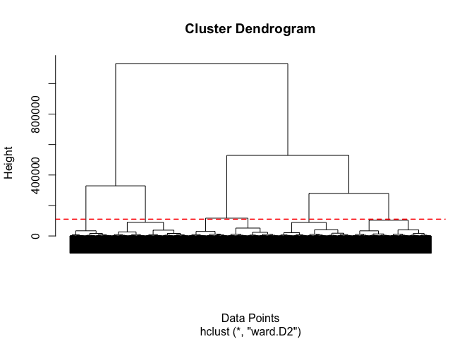
The resulting dendrogram shows the arrangement of the clusters formed at various levels of similarity with some significant density at the bottom. Let’s analyze the dendrogram:
- The height of the branches indicates the distance or dissimilarity between clusters.
- The observations are clustered based on their similarity, determined by the Euclidean distance.
- The ward linkage method works on the principle of minimizing the sum of squared distances between clusters.
- We can “cut” the dendrogram at a particular “height” to form a specific number of clusters. The selected cutting height determines the granularity of the clustering, with lower cuts resulting in multiple, smaller clusters and higher cuts resulting in fewer, larger clusters.
- The large vertical gap (indicating high dissimilarity) just above where the two clusters merge suggests a notable distinction between these merged clusters.
One strategy to find an optimal number of clusters is you can check the height of the vertical lines in the dendrogram and identify the point where the rate of change in height (distance) between the mergers decreases creating an “elbow.” The number of clusters at this point will be considered the optimal number. As we can see in the dendrogram, the optimal number of clusters for this data is six. You can also confirm the optimal number of clusters by plotting the variation in height (cluster distance) against the number of clusters, shown here:
#elbow point identification
last_heights <- tail(hc$height, 30)
num_clusters <- 31:2 #how many clusters do we want to evaluate?

#Plot the last 30 values against the range 2-31
plot(num_clusters, last_heights, type = 'o', col = 'blue', pch = 16,
     main = 'Cluster Distance vs Number of Clusters',
     xlab = 'Number of Clusters', ylab = 'Cluster Distance')

#Add a red dot at the elbow point
points(num_clusters[26], last_heights[26], col = 'red', pch = 16)
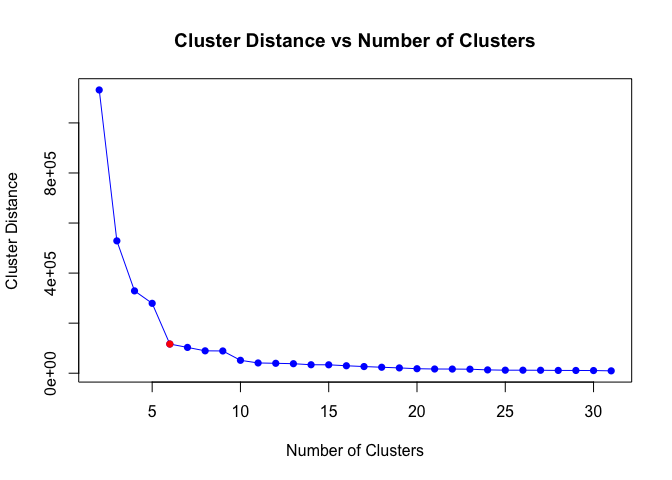
The plot shows that the variation in cluster distances diminishes considerably after the number of clusters reaches six, as indicated by the red dot. This point is considered the “elbow” point.
Now we’re ready to perform the cluster analysis. We’ll cut the dendrogram using the optimum number of 6 clusters and then assign the cluster label to each data point in our dataset. We’ll use the cutree function to segment the dendrogram at a height that yields the desired cluster quantity. Then, we’ll add the resulting cluster labels to the original data set, indicating the cluster to which each observation belongs.
This step is important for categorizing each data point into a specific group and facilitating further analysis. This helps with cluster profiling and understanding group characteristics. These aspects are essential for the interpretation and analysis of clusters.
#Cut the dendrogram to create six clusters
num_clusters <- 6
cluster_labels <- cutree(hc, k = num_clusters)

#Add cluster label to the original data
df_feature$cluster <- cluster_labels
Step 8: Visualize the cluster
In this step, to visualize the clusters, we’ll plot the variation of “Product ID” versus “Category Label” and color the graph based on the cluster each data point is assigned to. Further, we will use the “Category Label” variables to label the y-axis and identify the pattern of clustering accomplished by the model. We’ll create a scatterplot to visualize the clusters.
#Create a scatterplot to visualize the clusters
value_mapping <- levels(factor(df$"Category.Label"))
df_feature <- df_feature %>% mutate(Category_Label = factor(`Category Label`, label=value_mapping))
unique_categories <- unique(df_feature$Category_Label)

ggplot(df_feature, aes(x=as.factor(cluster), y=as.factor(`Category Label`))) +
  xlab("Categories") + ylab("Cluster ID") +
  scale_y_discrete(labels = value_mapping) +
  geom_count(aes(color=as.factor(cluster))) +
  scale_size_area(guide = "legend") +
  guides(fill = guide_legend(override.aes = list(color = NA)), color = "none", shape = "none")
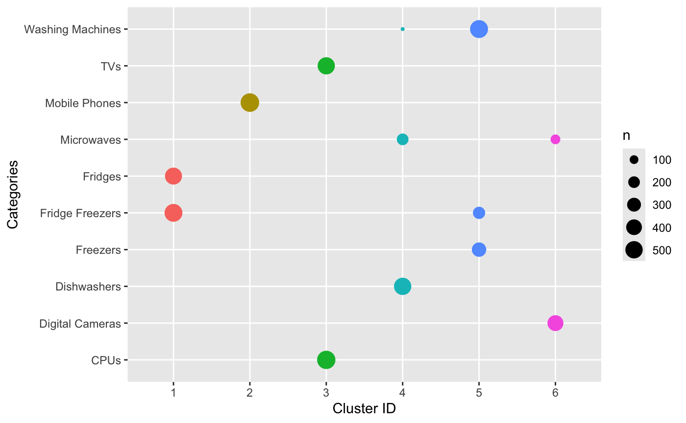
The scatterplot displays the six different clusters, each with a unique color. There isn't a direct true/false comparison that we can make because the cluster IDs might not (and probably should not) directly correlate to the categories.
We can observe that the model has merged instances of “Fridges” and “Fridge Freezers,” indicating a similarity between these categories. Similarly, “Dishwashers” and “Microwaves” have been combined into one cluster. However, observe that the model is experiencing confusion between “Digital Cameras,” “Mobile Phones,” and “TVs.” This confusion can be addressed with more training data or attributes.
We could reasonably conclude that an analysis using more data and more dimensions might help better interpret the clustering results. One strategy for that might be to include the IDs of the merchants or data derived from the name of the listing. For more information on other techniques for clustering, check out our tutorial on Cluster Analysis in R.
Summary
In this tutorial, you learned that hierarchical clustering is an unsupervised machine-learning algorithm that groups data into a tree of nested clusters. Hierarchical clustering is performed using Euclidean distance and the ward linkage method, with the results visualized in a dendrogram.
The hierarchical clustering algorithm effectively grouped the data into distinct clusters, with the dendrogram visually representing the hierarchical relationships. We identified the optimal number of clusters to be six, using the “elbow” method, and cut the dendrogram accordingly. We then visualized the clusters in a scatterplot, depicting the merging of various item categories into the six identified clusters. Overall, this tutorial demonstrated a comprehensive approach to understanding and leveraging the structure within the data set for potential applications like targeted marketing, inventory management, or customer segmentation.
Try watsonx for free
Build an AI strategy for your business on one collaborative AI and data platform called IBM watsonx, which brings together new generative AI capabilities, powered by foundation models, and traditional machine learning into a powerful platform spanning the AI lifecycle. With watsonx.ai, you can train, validate, tune, and deploy models with ease and build AI applications in a fraction of the time with a fraction of the data.
Try watsonx.ai, the next-generation studio for AI builders.
Next steps
Explore more articles and tutorials about watsonx on IBM Developer.