Tutorial
K-means clustering using R on IBM watsonx.ai
Learn the fundamentals of performing K-means clustering in R by using IBM Watson Studio Jupyter Notebooks on watsonx.aiK-means clustering is one of the most popular unsupervised learning algorithms, a class of machine learning algorithms that can be used to find patterns in unlabeled data. Clustering algorithms work by classifying data into similar groups or clusters and labeling them so that they can be used for supervised learning. IBM watsonx.ai is an enterprise studio offering for AI builders that integrates all parts of the AI and Data Science lifecycle into one Hybrid Cloud platform for developers. This tutorial will explain the fundamentals of running the K-means algorithm in R by using IBM Watson Studio Jupyter Notebooks on watsonx.ai.
The tutorial does not assume previous experience with unsupervised learning or the K-means model. More information on the different types of machine learning algorithms can be found in this IBM Developer article, "Models for machine learning."
What is K-means clustering?
The K-means clustering algorithm (or K-means algorithm) is one of the most popular clustering techniques and machine learning algorithms. The algorithm works by assigning data points to clusters based on a mathematical distance metric (like Euclidean distance) to the center of the cluster. The K-means algorithm’s main goal is to minimize the sum of distances between data points and their respective clusters.
In K-means clustering, the letter "K" represents the number of clusters, or distinct groups, that the algorithm will identify in the data. For example, if K = 2, there will be two clusters. Essentially, it is an iterative process of using a distance metric to measure the similarity of the data within the cluster and to keep adjusting the cluster boundaries until the optimal ones are found.
K-means clustering offers some unique benefits over other clustering techniques, which has led to its widescale adoption. It is relatively simple to implement, scales well to large data sets, guarantees convergence to the centroids, easily adapts to new examples, and generalizes quite robustly to clusters of varying shapes and sizes. Some of the popular real-world use cases for K-means clustering include, but are not limited to, insurance fraud detection, customer segmentation, document classification, delivery store optimization, and cybercrime identification.
K-means clustering is often used when you don’t have a specific outcome variable to predict. Instead, the algorithm automatically discovers features in data to find collections of observations that share similar characteristics. For example, within the context of an image data set, a K-means clustering algorithm could automatically classify different animals into separate groups based on common characteristics such as mammals, reptiles, and amphibians.
Additionally, K-means clustering should not be confused with K-nearest neighbors (KNN), a similarly named supervised learning algorithm that can be used for regression and classification.
Implementing K-means clustering with Watson Studio and watsonx.ai
IBM watsonx.ai enables organizations to accelerate AI-powered transformation by enhancing productivity and reducing complexity. It is a cloud-native solution that enables you to put your data to work quickly and efficiently. To perform K-means clustering, watsonx users can seamlessly integrate their data into Watson Studio Jupyter Notebooks and run the algorithm with R.
The main features of IBM watsonx.ai include:
Simplifying and automating access to data across multicloud and on-premises data sources without moving data
Universal safeguarding the use of all data, regardless of source, with applicable governance
Providing business users with a self-service experience for finding and using data
Building and deploying trustworthy machine learning models using AutoAI or customizing the models in Python and R notebooks
Using AI-powered capabilities to automate and orchestrate the data lifecycle
Prerequisites
This tutorial contains general instructions and excerpts of code. To follow along or modify the code for your own use, see the full code on GitHub.
To follow this tutorial, you need an IBM Cloud Account. If you do not have an IBM Cloud account, you can sign up for one to try watsonx.ai for free. If you are creating a free account, Watson Studio, Watson Machine Learning, and Cloud Object Storage instances on the Lite plan are all provisioned for you.
Steps
In this tutorial, you use K-means clustering to show how a real estate agency might identify groups of similar properties to show customers personalized property recommendations based on their budget.
These are the steps you will follow:
- Create a watsonx.ai project and open a Jupyter Notebook.
- Generate a data set.
- Perform exploratory data analysis.
- Choose K clusters.
- Interpret K-means clustering.
Step 1. Create a watsonx.ai project
Log in to watsonx.ai by using your IBM Cloud account.
Create a watsonx.ai project by clicking the + sign in the upper right of the Projects box.

Create and open a Jupyter Notebook.
On the Assets tab of the project home page, click New task.

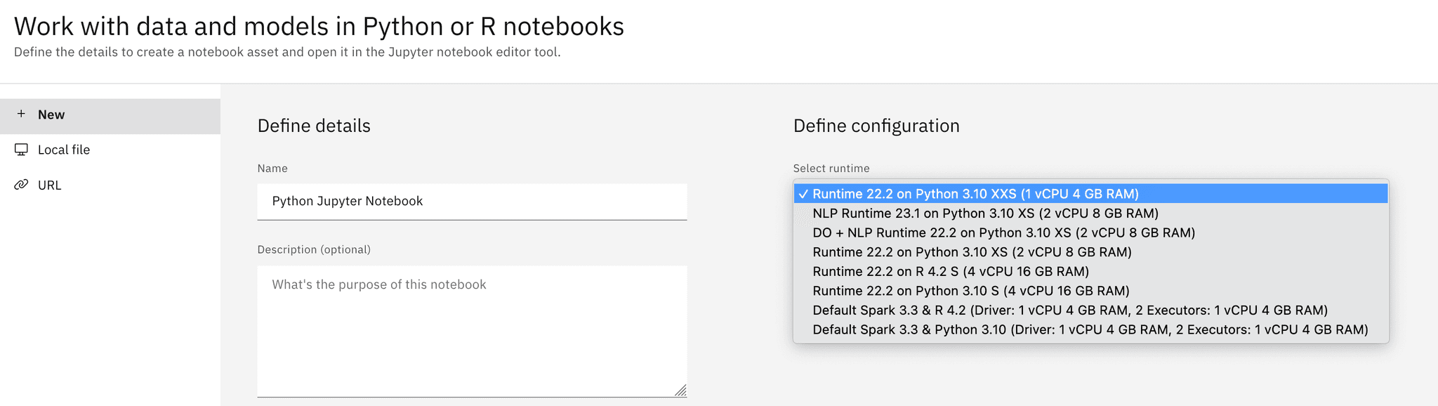
Select Work with data models in Python or R notebooks.

Name your notebook and, optionally, give it a description.
In the Select runtime drop-down menu, make sure that an R run time is selected. The Spark R runtimes are applicable for Big Data use cases. If you are unsure which runtime to pick, select the latest version of the standard R runtime, as Spark is not applicable to this tutorial.
Step 2. Generate a data set
Users can choose from multiple open-source libraries to perform k-means clustering. This tutorial uses functions from the popular MASS and stats R libraries to generate a test data set and perform the clustering.
To generate your data:
Import the required libraries.
 library(ggplot2)
 library(MASS)
 library(tidyverse)
 library(dplyr)
Generate a mock data set for clustering:
 n_samples <- 5000
 n_features <- 5
 centers <- 5
 cluster_std <- 0.1

 # Create an empty matrix to store the data
 X <- matrix(0, n_samples, n_features)

 # Define random cluster centers
 set.seed(42)
 random_centers <- matrix(runif(centers * n_features, -10, 10), nrow=centers)

 # Populate the matrix with blobs
 for (i in 1:centers) {
   # Calculate start and end indices for this blob
   start_idx <- (i-1) * (n_samples / centers) + 1
   end_idx <- i * (n_samples / centers)

   # Generate multivariate normal data for this blob
   X[start_idx:end_idx, ] <- mvrnorm(n_samples / centers, random_centers[i,], diag(cluster_std, n_features))
 }
Convert your data to a DataFrame object.
 # Generate the labels
 y <- rep(1:centers, each=n_samples/centers)

 feature_names <- paste0("feature_", 0:(n_features-1))
 df <- as.data.frame(X)
 colnames(df) <- feature_names

 # Add the labels
 df$label <- y
Rename columns to correspond to our real estate agency scenario, with the following syntax:
colnames(df) <- c('property_size', 'num_rooms', 'distance_center', 'age', 'utility_cost', 'label')
Step 3. Perform exploratory data analysis
After you've successfully imported your data set, the next step is to perform exploratory data analysis (EDA) to better understand your data. EDA can consist of making visualizations of the data, cleaning and preprocessing it, embedding any text data to convert it into a numerical form, and choosing how to deal with missing or imbalanced data. The exact details on how to perform EDA are outside the scope of this tutorial, but the code here will provide a simplified example.
Following are some typical steps involved in EDA.
Visualize the data. If your data has more than two features, you will need to visualize it in a two-dimensional space. For example, you can make a scatter plot of two features.
 # Plot the data
 p <- ggplot(df, aes(x=distance_center, y=num_rooms, color=factor(label))) +
   geom_point(aes(shape=factor(label)), size=3) +
   scale_color_viridis_d(name="Cluster") +
   labs(title="Blobs Visualization", x="Feature_0", y="Feature_1") +
   theme_minimal() +
   theme(legend.position="top")
 p
Ensure that the columns were imported with the correct data types.
str(df)Check for missing values. Consider imputation or removing missing values if there are many.
colSums(is.na(df))Check for outliers. Consider removing outliers if appropriate so as not to skew the final cluster shapes.
 # Calculate z-scores
 z_scores <- scale(df)

 # Filter rows where all absolute z-scores are greater than 2.5
 outlier_rows <- apply(abs(z_scores) > 2.5, 1, all)

 # Print rows considered as outliers
 print(df[outlier_rows, ])
Standardize scales.
Identify correlated features. Consider using a pairwise plot to identify strong correlations and remove features that are highly correlated.

Step 4. Choose K
When EDA is complete, you must choose how many clusters to separate your data into. If you already know how many groups you want to make, you can set K manually with the centers argument of the kmeans() function. If you are not sure how many groups are appropriate, you can use the elbow method to test different K values.
The elbow method works by computing the Within Cluster Sum of Squares (WCSS), which quantifies the variance (or spread) of data within a cluster. If WCSS decreases, the data within the clusters are more similar. As K increases, there should be a natural decrease in WCSS because the distance between the data in its cluster to its center will be smaller. The ideal K is the "elbow" point of the graph, where WCSS stops decreasing or starts to marginally decrease as K increases. The elbow method is particularly useful for big data sets that have lots of potential clusters because there is a trade-off between computational power required to run the algorithm and the number of clusters generated.
Use the following steps to implement the elbow method:
- Create a list to hold WCSS values at different K values.
- Fit the clusters with different k values.
- At each k value, append the WCSS value to the list.
Graph the WCSS values versus the number of clusters.
 # Define the max number of clusters to test
 max_clusters <- 10

 # Initialize a vector to store the WCSS values
 wcss <- numeric(max_clusters)

 # Loop over several values of k (number of clusters)
 for (k in 1:max_clusters) {
   set.seed(42)  # Set seed for reproducibility
   kmeans_model <- kmeans(df, centers=k, iter.max=300, nstart=10)
   wcss[k] <- kmeans_model$tot.withinss
 }

 # Plot the results
 ggplot(data.frame(k = 1:max_clusters, wcss = wcss), aes(x = k, y = wcss)) +
   geom_line() +
   geom_point() +
   ggtitle("Elbow Method") +
   xlab("Number of clusters") +
   ylab("WCSS")
Select the “elbow point” of the graph as your K value.

Rerun K-means with your chosen k value. Use the n_clusters parameter to set K. Use the
set.seed()function for reproducability.
The graph indicates that 5 is the ideal number of clusters, which makes sense intuitively as we set the centers argument equal to 5 when generating our data.
    set.seed(42)  # Set seed for reproducibility
    kmeans_model <- kmeans(df, centers=5, nstart=10)
    df$predicted_labels <- as.factor(kmeans_model$cluster)
Step 5. Interpret K-means clustering
Using a dimensionality reduction technique like Principal Component Analysis (PCA), you can graph your clusters in a two-dimensional space and visualize the groupings. This tutorial does not cover the exact details of PCA, but our data has five dimensions, and thus dimensionality reduction is needed to visualize clusters of data with more than two dimensions in a 2-D space. It's likely that most data sets that you encounter when performing K-means clustering have data with more than two dimensions.
The following steps are the high-level steps to interpret K-means clustering.
Visualize your clusters.

Notice the distance between clusters and cluster means. Clusters that are closer together are likely to be more similar than clusters located further apart.
Notice any outliers. Certain data might not fit neatly into a cluster. These points can be considered as outliers or anomalies.
In anomaly detection use cases, any data points that do not belong to a specific cluster or are far from cluster centers can be considered outliers. After clusters are identified, you have a starting point to try and identify why your data might fall into certain groups. When visualized, if there is a small distance between two clusters (like the red and blue clusters in the previous graph), that means that the difference between those two groupings is likely less pronounced than between other ones.
Summary
To summarize, K-means clustering is a powerful unsupervised learning algorithm with many applicable real-world business use cases for automatically grouping data. With Watson Studio R Notebooks on watsonx.ai, you can deploy this powerful algorithm on data wherever it lives in a hybrid cloud environment.
The real estate agency use case in this tutorial identified five distinct property groupings, which allows the agency to advise customers accordingly. With this data, the agency can determine whether an individual property is competitively priced relative to similar properties by comparing prices within clusters. Additionally, the agency can show personalized recommendations to customers who are interested in specific property profiles or price points.
By categorizing each property into a cluster, the real estate agency now has a labeled data set to perform supervised learning with. Using the computed cluster label as an outcome variable, the agency could use a supervised method like Linear Regression to train a model to predict which category future properties would fall into. This could be used to recommend new properties to customers as they are identified. Additionally, with this labeled data, the agency could consider using this data to train an artificial neural network (also commonly known as deep learning).
Try watsonx for free
Build an AI strategy for your business with IBM watsonx, which brings together new generative AI capabilities, powered by foundation models, and traditional machine learning into a powerful platform spanning the AI lifecycle. With watsonx.ai, you can train, validate, tune, and deploy models with ease and build AI applications in a fraction of the time with a fraction of the data.
Try watsonx.ai, the next-generation studio for AI builders.
Next steps
Explore more articles and tutorials about watsonx on IBM Developer.
If you want to learn more, take a look at the following resources:
Machine learning (both unsupervised and supervised learning)
- Machine learning for developers
- Models for machine learning
- What is supervised learning?
- Unsupervised learning for data classification
Neural networks (and deep learning)
- AI vs. Machine Learning vs. Deep Learning vs. Neural Networks: What’s the difference?
- What are neural networks?
- A neural networks deep dive
- Neural networks from scratch
Linear regression algorithms