Tutorial
Creating a deep learning neural network for anomaly detection on time-series data
Using Keras and TensorFlow to create deep learning LSTM autoencodersAfter introducing you to deep learning and long-short term memory (LSTM) networks, I showed you how to generate data for anomaly detection. Now, in this tutorial, I explain how to create a deep learning neural network for anomaly detection using Keras in TensorFlow.
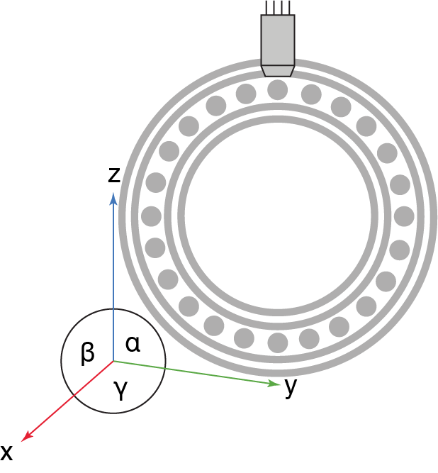
As a reminder, our task is to detect anomalies in vibration (accelerometer) sensor data in a bearing as shown in the following figure:
When talking about deep learning, many developers often talk about libraries such as TensorFlow and PyTorch. Those are great tools, but in my opinion provide relatively low-level support, meaning you have to think a lot about linear algebra and the shapes of matrices. Keras, which is now part of TensorFlow, on the other hand, is a high-level abstraction layer on top of the popular deep learning framework. Therefore, creating and maintaining neural networks has been democratized by Keras.
What you'll need to build your app
- An IBM Cloud account. (Sign up for an IBM Cloud account.)
- A developer environment to run Jupyter notebooks, such as JupyterLab or an IDE like VS Code. Or, you can follow this tutorial to create a fully cloud-based JupyterLab development environment that makes use of IBM Cloud Code Engine and provides automated backup and a variety of resource configurations that run even if you close your laptop.
What is TensorFlow?
Google released TensorFlow under the Apache 2.0 open source license in 2015.
TensorFlow has two components: an engine executing linear algebra operations on a computation graph and some sort of interface to define and execute the graph. The engine in TensorFlow is written in C++, and although different language bindings for TensorFlow exist, the most prominent one is Python.
The engine of TensorFlow can run on CPUs, GPUs, TPUs; for mobile and embedded devices there is TensorFlow Lite; and, for the browser, there is TensorFlow.js. There are three components of the engine:
- A client component that creates and takes your computational execution graph and submits it to the master component.
- A master component that parses the computational execution graph and distributes it to worker components.
- Worker components that execute parts of the computational execution graph.
Worker components can make use of specialized hardware like GPUs and TPUs. Distributed TensorFlow can run on multiple machines.
In other words, TensorFlow is nothing more than a domain specific language (DSL) expressed in Python to define a computational execution graph for linear algebra operations and a corresponding (parallel) execution engine for running an optimized version of it.
What is Keras?
You might have noticed that TensorFlow can get to low-level linear algebra sometimes, and the code doesn't even look nice from a mathematician's perspective. Therefore, Google hired Francois Chollet to make Keras TensorFlow’s default API.
You can learn more about Keras in its Getting Started docs.
Create a Keras neural network for anomaly detection
The code for the anomaly detector is provided in a Jupyter notebook in GitHub.
This notebook is part of the CLAIMED Elyra Component Library which supports a drag-and-drop experience for data science. To install Elyra into your JupyterLab environment, follow the instructions in the Elyra documentation.
To make things simple just clone the repository:
git clone https://github.com/IBM/claimed.git
You can just run this notebook on your local Jupyter environment top down, and it will create an HTTP endpoint that accepts multidimensional data in JSON format. Let’s have a look at selected code cells.
Create an unsupervised machine learning model
If you want to classify multi-variate time series state of the art pre-processes them usually using FFT (Fast Fourier Transformation) to obtain the frequency spectrum or Wavelet transformation (to extract features on the wave forms). Those features (the wavelet ones or the ones from FFT) can be fed into an ordinary classifier like Gradient Boosted Trees. This only works with labeled data, so we need to know which part of the time series are normal and which are not. But we want unsupervised machine learning because even if we have no idea which parts of the signal are normal and which are not we want to detect anomalies.
The simplest approach to unsupervised machine learning is to feed the frequency bands FFT creates into an ordinary feed-forward neural network.
With this approach we transform our n-dimensional input data into a t*n (t times n) dimensional data set (the t frequency bands for the t input data steps). This is our new t*n dimensional input feature space. We can use the tn dimensional input space to train a feed-forward neural network. Our hidden layer in the feed-forward neural network has only a comparably low number of neurons (e.g. 100 instead of the tn we have in the input and output layer). This is called a bottleneck and turns our neural network into an autoencoder.
We train the neural network by assigning the inputs on the input and output layers. The neural network will learn to reconstruct the input on the output. But the neural network has to learn the reconstruction going through the 100-neuron hidden-layer bottleneck. This way, we prevent the neural network from learning about any noise or irrelevant data. We will skip this step here because the performance of such an anomaly detector is usually quite low.
Improve anomaly detection by adding LSTM layers
We can outperform state-of-the-art time series anomaly detection algorithms and feed-forward neural networks by using long-short term memory (LSTM) networks.
Based on recent research (the 2012 Stanford publication titled Deep Learning for Time Series Modeling by Enzo Busseti, Ian Osband, and Scott Wong), we will skip experimenting with deep feed-forward neural networks and directly jump to experimenting with a deep, recurrent neural network because it uses LSTM layers. Using LSTM layers is a way to introduce memory to neural networks that makes them ideal for analyzing time-series and sequence data.
To get started let's reshape our data a bit because LSTMs want their input to contain windows of times.
def lstm_data_transform(data, num_steps=5):
    x = []
    for i in range(data.shape[0]):
        # compute a new (sliding window) index
        end_ix = i + num_steps        # if index is larger than the size of the dataset, we stop
        if end_ix >= data.shape[0]:
            break        # Get a sequence of data for x
        seq = data[i:end_ix]
        x.append(seq)
    return np.array(x)
Now let’s create the neural network:
# design network

def create_model():
    model = Sequential()
    for _ in range(lstm_layers):
        model.add(LSTM(lstm_cells_per_layer,input_shape=(timesteps,dim),return_sequences=True))
    model.add(Dense(dim))
    model.compile(loss='mae', optimizer='adam')
    return model
Let's walk through this code. First, we create an instance of a Sequential model (model = Sequential()). This allows us to add layers to the model as we go.
Then, we add LSTM layers. We can configure how many layers and how many LSTM cells per layer we want. The more layers you add the more accurate the predictions are (up to a certain point), but the more compute power is necessary. In most cases, tuning the neural network topology and hyperparameters is considered "black magic" or "trial-and-error."
To get back to normal, we finalize with a normal, fully connected feed-forward layer to bring down the dimensions to three again (model.add(Dense(dim))).
Finally, we compile the model with two parameters (model.compile(loss='mae', optimizer='adam')):
loss=mae, which means that the training error during training and validation is measured using the "mean absolute error" measure.adam, which is a gradient decent parameter updater.
Provide the HTTP service interface
A lot of neural networks are used in batch processing (data at rest) but in our case we want to be able to analyze streaming data (data in motion). Therefore, we want to be able to continuously ingest data and have it analyzed in (near) real time by our neural network model. So, we encapsulate the model behind an HTTP endpoint within a Docker container image which can be provisioned easily (for example, on Knative using IBM Code Engine).
We are using FLASK for turning ordinary python functions into HTTP endpoints. The following functions accept chunks (windows) of multidimensional time-series data and performs a training step on the neural network (using that particular window of data). I have provided an image for your deployment in my Docker Hub; this image is based on the following Dockerfile available in the CLAIMED component library repo.
@app.route('/send_data', methods=['POST'])
def send_data():
    message = request.get_json()
    #message = message[1:-1] # get rid of encapsulating quotes
    #json_array = json.loads()
    data = np.asarray(message)
    print(data)
    data = lstm_data_transform(data, num_steps=timesteps)
    doNN(data)
    return json.dumps(loss_history)
Other functions include:
reset _model– this is useful to start from scratch in case dirty data poisoned your modeget _loss_as_json– get the history of reconstruction errors as JSON arrayget_loss_as_image– returns a nice plot of your loss history to assess if there was an anomaly
Viewing the data from our unsupervised ML model (our anomaly detector)
To illustrate and test functionality of our anomaly detector, we created a test notebook.
Let’s review the code.
We'll start with a little example of two "pickled" data sets (the pickle interface is the serialization and deserialization framework in Python) – one containing healthy data and one containing broken data to develop the neural network. We need to deserialize (rematerialize) those two arrays from the pickle files.
data_healthy = pickle.load(open('watsoniotp.healthy.pickle', 'rb'))
data_broken = pickle.load(open('watsoniotp.broken.pickle', 'rb'))
First, we have a look at the healthy data. Notice that while this system oscillates between two semi-stable states, it is hard to identify any regular patterns.
fig, ax = plt.subplots(num=None, figsize=(14, 6), dpi=80, facecolor='w', edgecolor='k')
size = len(data_healthy)
#ax.set_ylim(0,energy.max())
ax.plot(range(0,size), data_healthy[:,0], '-', color='blue', animated = True, linewidth=1)
ax.plot(range(0,size), data_healthy[:,1], '-', color='red', animated = True, linewidth=1)
ax.plot(range(0,size), data_healthy[:,2], '-', color='green', animated = True, linewidth=1)
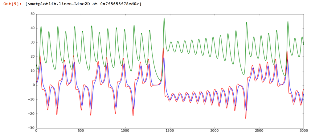
Next, run the cell look at the same chart after we've switched the test data generator to a broken state. The obvious result is that we see much more energy in the system. The peaks are exceeding 200 in contrast to the healthy state which never went over 50. Also, in my opinion, the frequency content of the second signal is higher.
fig, ax = plt.subplots(num=None, figsize=(14, 6), dpi=80, facecolor='w', edgecolor='k')
size = len(data_healthy)
#ax.set_ylim(0,energy.max())
ax.plot(range(0,size), data_broken[:,0], '-', color='blue', animated = True, linewidth=1)
ax.plot(range(0,size), data_broken[:,1], '-', color='red', animated = True, linewidth=1)
ax.plot(range(0,size), data_broken[:,2], '-', color='green', animated = True, linewidth=1)
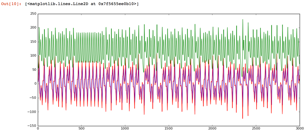
Let's confirm the frequency of the second signal is higher by transforming the signal from the time to the frequency domain.
data_healthy_fft = np.fft.fft(data_healthy)
data_broken_fft = np.fft.fft(data_broken)
The chart now contains the frequencies of the healthy signal.
fig, ax = plt.subplots(num=None, figsize=(14, 6), dpi=80, facecolor='w', edgecolor='k')
size = len(data_healthy_fft)
ax.plot(range(0,size), data_healthy_fft[:,0].real, '-', color='blue', animated = True, linewidth=1)
ax.plot(range(0,size), data_healthy_fft[:,1].imag, '-', color='red', animated = True, linewidth=1)
ax.plot(range(0,size), data_healthy_fft[:,2].real, '-', color='green', animated = True, linewidth=1)
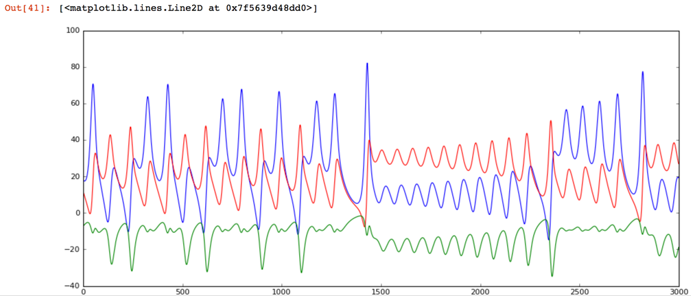
Note: We are plotting the imaginary part of the red dimension to see three lines because two dimensions on this dataset are completely overlapping in frequency and the real part is zero. Remember, the way FFT (fast Fournier transform) works is retuning the sine components in the real domain and the cosine components in the imaginary domain. Just a hack mathematicians use to return a tuple of vectors.
Let's contrast this healthy data with the broken signal. As expected, there are a lot more frequencies present in the broken signal.
fig, ax = plt.subplots(num=None, figsize=(14, 6), dpi=80, facecolor='w', edgecolor='k')
size = len(data_healthy_fft)
ax.plot(range(0,size), data_broken_fft[:,0].real, '-', color='blue', animated = True, linewidth=1)
ax.plot(range(0,size), data_broken_fft[:,1].imag, '-', color='red', animated = True, linewidth=1)
ax.plot(range(0,size), data_broken_fft[:,2].real, '-', color='green', animated = True, linewidth=1)
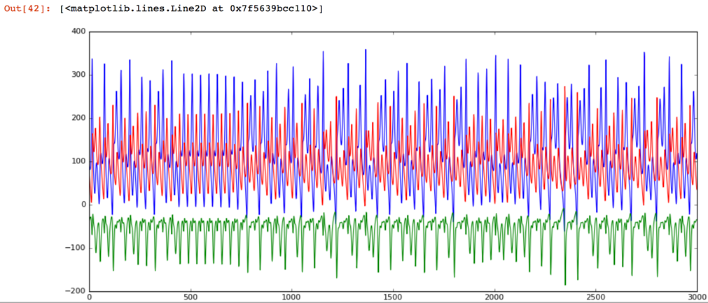
Because the anomaly detector provides an HTTP endpoint we need to transform the numpy array to a JSON string to be able to send it over HTTP.
# convert test data from numpy to json (to be used when calling th web service via HTTP)
data_healthy = data_healthy.tolist()
data_healthy = json.dumps(data_healthy)
data_broken = data_broken.tolist()
data_broken = json.dumps(data_broken)
Calling the service is simple:
# test with healthy data
for _ in range(3):
    r = requests.post(url, data=data_healthy, headers=headers)
    assert(r.status_code==200)
Let's plot the losses to see if we can detect a spike on the abnormal (broken) data using the following code.
# display loss (reconstruction) history
from IPython.display import Image
Image("http://localhost:8080/get_loss_as_image.png")
Behind the scenes in the anomaly detector service, the following code is used to render the image:
fig, ax = plt.subplots(num=None, figsize=(14, 6), dpi=80, facecolor='w', edgecolor='k')
size = len(data_healthy_fft)
#ax.set_ylim(0,energy.max())
ax.plot(range(0,len(losses)), losses, '-', color='blue', animated = True, linewidth=1)
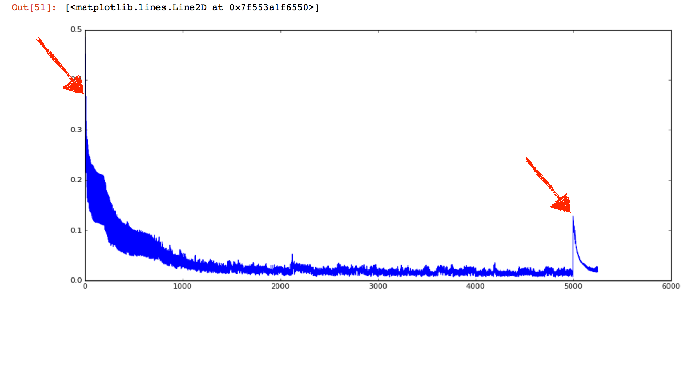
And here it is. On time step 5000 (see the previous figure), we can clearly see that something is going on. Note that the initial loss was higher, but this is because initially the weights of the neural network have been initialized randomly, therefore leading to bad predictions.
Conclusion
In this tutorial, you’ve learned:
- How deep learning and an LSTM network can outperform state-of-the-art anomaly detection algorithms on time-series sensor data – or any type of sequence data in general.
- How to use Node-RED and the Lorenz Attractor Model to generate realistic test data as a physical model is sampled.
- How TensorFlow accelerates linear algebra operations by optimizing executions and how Keras provides an accessible framework on top of TensorFlow
- How a neural network can be put behind an HTTP service API for easy consumption and scaling